Living Room Decorating Ideas: A Warm, Lived-In Guide to Getting It Right
A warm, lived-in guide to decorating your living room — the order to decorate in, the rules designers use, and 25 ideas that teach you how to make confident decorating decisions.
These living room decorating ideas are about the process, not the shopping list. The fastest way to a warm, lived-in living room isn’t buying more decor — it’s making decorating decisions in the right order: how you actually live in the room first, then the focal point, then the big pieces, then the color formula, and only at the very end the small styling details. Decorate in that sequence and every choice gets easier, because each decision narrows the next one. Decorate backwards — pillows before palette, art before layout — and even beautiful pieces fight each other.
This guide walks you through 25 decorating decisions in the order that prevents expensive mistakes, from the focal point to the final styling edit. And once the process clicks, these cozy living room ideas will give you plenty of warm, inviting looks to aim the whole plan toward.
Key Takeaways
Where do I start when decorating a living room?
Start with how you live in the room (lounging, hosting, TV, reading), then pick one focal point, then buy the biggest pieces first — sofa, rug, main chairs — before any small decor.
What order should I decorate a living room in?
Function first, then focal point, then layout, then color palette, then anchor furniture, then rug, then lighting, then walls, then textiles, then personal styling details.
What is the 60-30-10 rule in decorating?
A color-balancing formula: about 60% dominant color, 30% secondary color, 10% accent color. It keeps the room cohesive without looking flat.
How do I make my living room feel lived-in instead of staged?
Mix one old or vintage piece with new furniture, leave some negative space, style in odd numbers, and decorate around your real habits — not around a catalog photo.
What is the biggest decorating mistake beginners make?
Buying small decor before deciding the big things. Pillows and accessories bought before the sofa, rug, and palette almost never fit the finished room.
| Step | Decision to make | Rule of thumb |
|---|---|---|
| 1 | How you live in the room | List real activities: TV, reading, hosting, napping |
| 2 | Focal point | Fireplace, window, art, or TV — seating faces it |
| 3 | Layout and walkways | Keep 30–36 inches clear on main paths |
| 4 | Color formula | 60% dominant, 30% secondary, 10% accent |
| 5 | Anchor furniture | Sofa first, about two-thirds the seating-wall length |
| 6 | Rug size | Front legs of all seating on the rug |
| 7 | Lighting layers | Ambient + task + accent, never one overhead alone |
| 8 | Walls | Art center at 57 inches; curtains high and wide |
| 9 | Textiles | Texture before color; repeat each color 3 times |
| 10 | Final edit | Remove one object per surface, then live with it a week |
Living Room Decorating Ideas That Start With a Focal Point
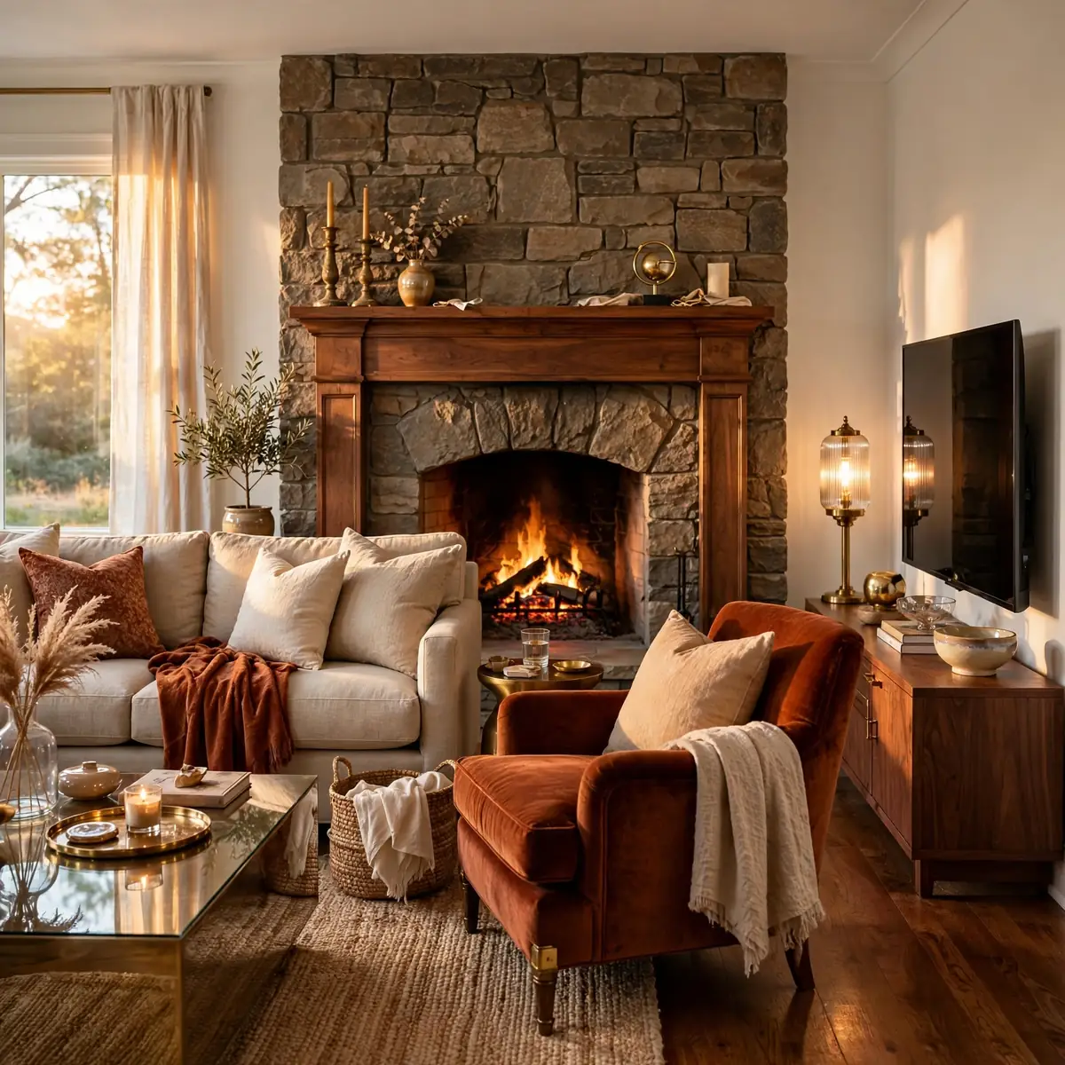
Every decorating decision gets easier once the room has a focal point — the one spot the eye lands on first. A fireplace, a big window, a statement art piece, or even the TV can be the anchor; what matters is that the seating faces it deliberately instead of drifting. The concrete example: in a room with both a fireplace and a TV, choose the fireplace as the focal point and place the TV on an adjacent wall at an angle — the seating faces the fire, the TV stays watchable, and the room stops feeling like it’s arguing with itself. Without a chosen focal point, furniture floats and every later choice feels random.
Quick tips:
- Quick tips:
- If the room has no natural focal point, create one with oversized art.
- Arrange the main seating to face the focal point, not the doorway.
- When fireplace and TV compete, pick one as primary and angle the other.
Follow the 60-30-10 Color Formula
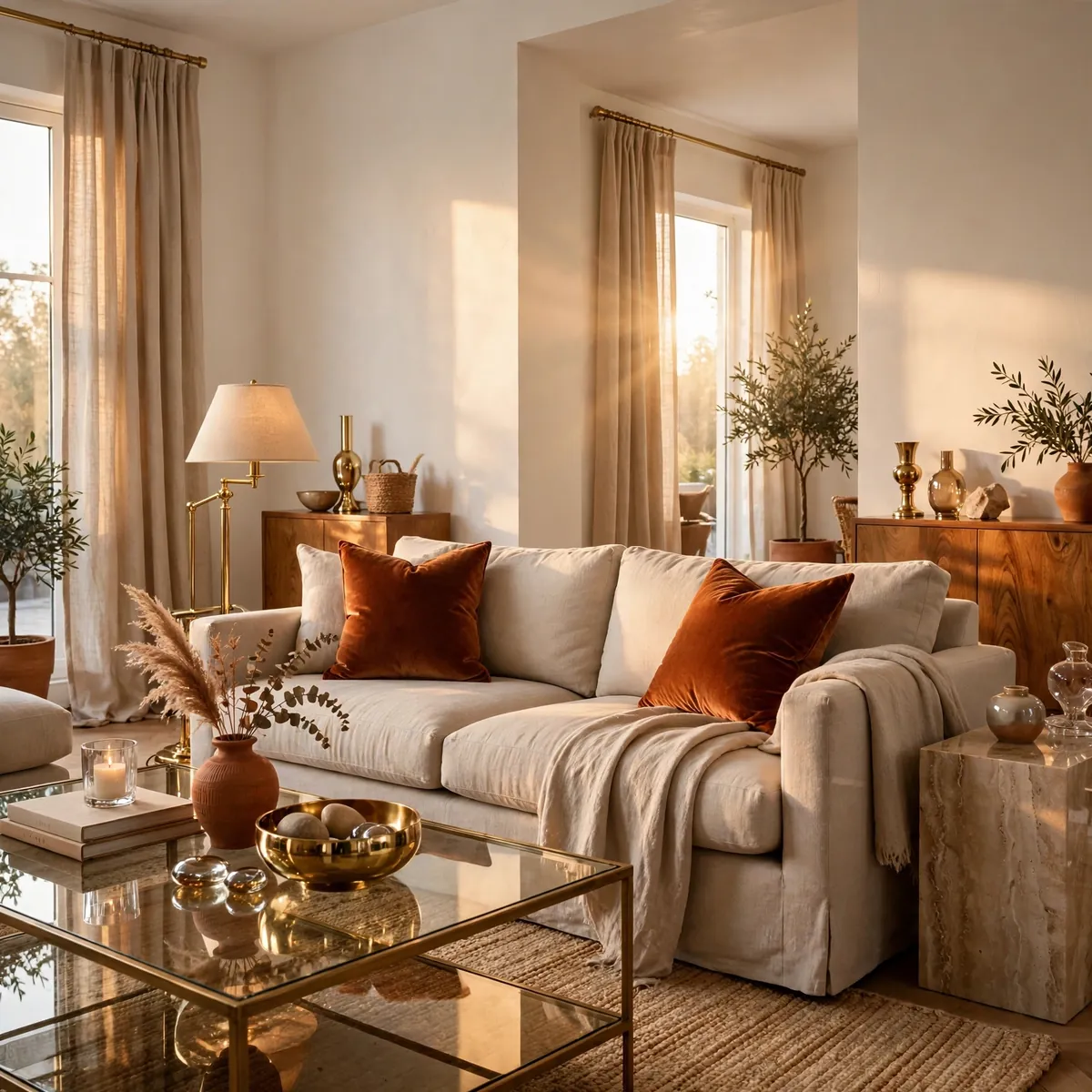
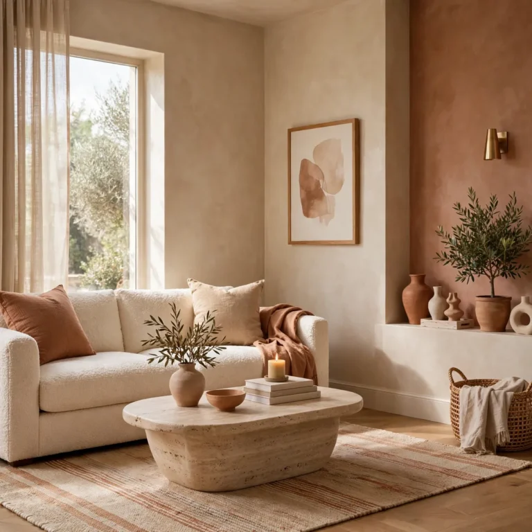
The 60-30-10 rule is the simplest way to build a color palette that feels designed: roughly 60% of the room in a dominant color, 30% in a secondary color, and 10% in an accent. The dominant color usually lives on walls and the sofa, the secondary on rugs and curtains, and the accent in pillows, art, and small objects. The concrete example: warm white walls and an oatmeal sofa (60%), a jute rug and sand linen curtains (30%), and rust velvet pillows plus a terracotta vase (10%) — calm, cohesive, with just enough energy. The formula prevents both the all-beige flatness and the too-many-colors chaos.
Quick tips:
- Quick tips:
- Assign the 60% to walls and the largest furniture piece.
- Keep the 10% accent to small, swappable items like pillows.
- When in doubt, make the dominant color a warm neutral.
Decorate in Order: Biggest Pieces First
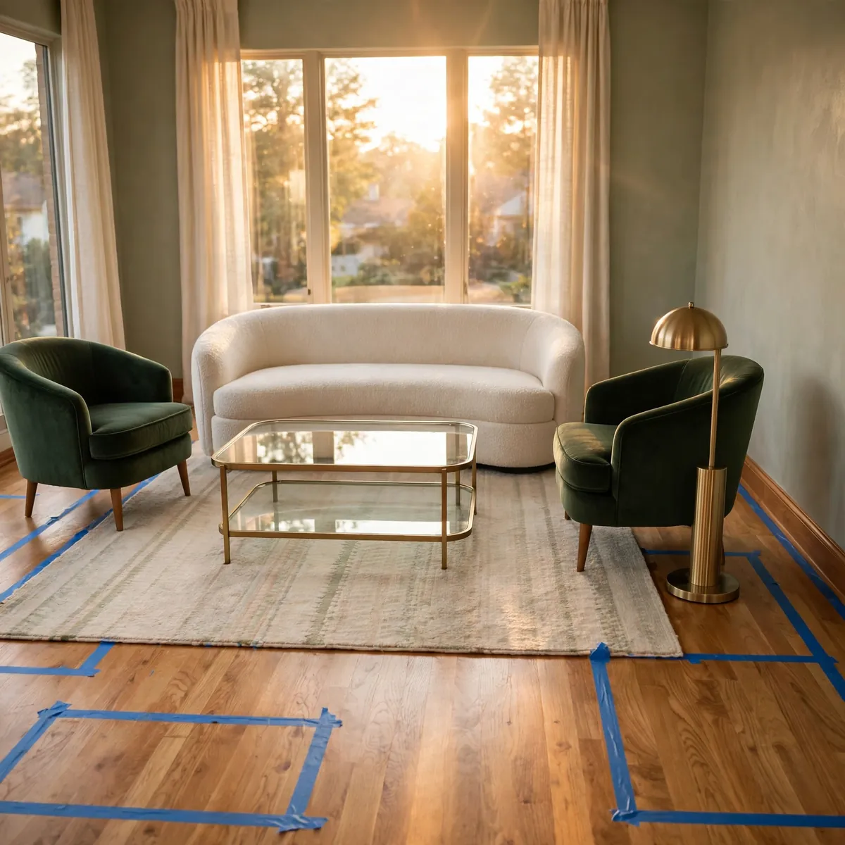
The order you decorate in matters more than what you buy, because big decisions constrain small ones — never the reverse. Buy the sofa, the rug, and the main chairs before a single pillow or candle, since textiles and accessories are chosen to match furniture, not the other way around. The concrete example: a decorator who buys the rust velvet pillows first ends up hunting for a sofa that works with rust; the decorator who buys the oatmeal sofa first can choose any pillow in the world. Permanent and expensive decisions (layout, palette, sofa) always come before flexible and cheap ones (pillows, art, objects).
Quick tips:
- Quick tips:
- Sequence: function → focal point → layout → palette → sofa → rug → lighting → walls → textiles → styling.
- Never buy accessories before the furniture they accessorize.
- Tape out furniture footprints on the floor before ordering anything.
Arrange Seating for Conversation, Not the TV
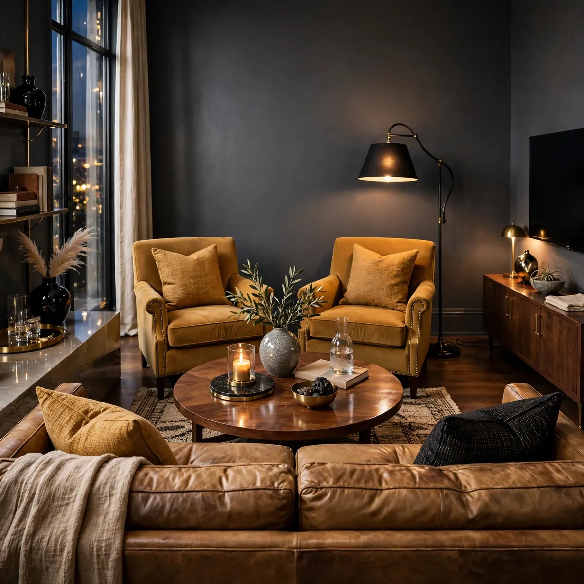
A lived-in living room arranges seating so people face each other, with the TV accommodated rather than worshipped. Pull chairs toward the sofa to form a soft U or circle, keep seats within about 8 feet of each other, and the room becomes a place for talking that also happens to have a television. The concrete example: a sofa facing two armchairs angled inward around the coffee table, TV mounted on the side wall visible from the sofa’s left end — conversation is the default arrangement, and movie night just means turning heads slightly. Rooms arranged in a single row facing a screen feel like waiting rooms, not living rooms.
Quick tips:
- Quick tips:
- Keep conversational seating within about 8 feet of each other.
- Angle chairs inward toward the sofa, not parallel to it.
- Put the TV where it’s watchable without being the room’s throne.
Keep 30 Inches of Walkway Clear
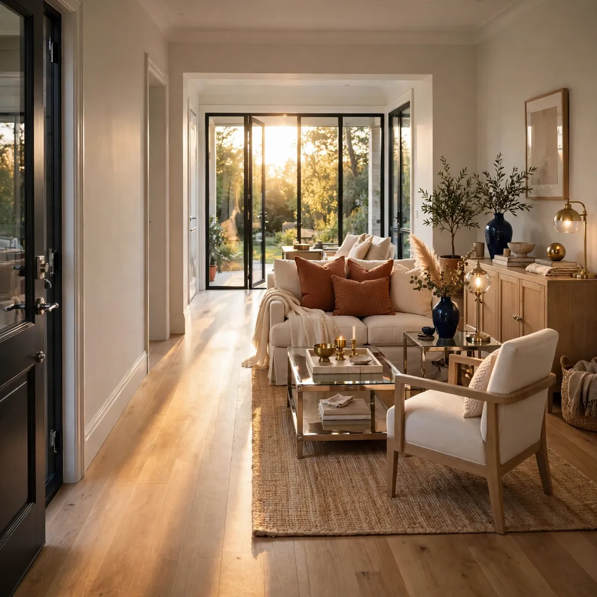
Good flow is invisible and bad flow ruins everything — if people sidestep furniture to cross the room, the layout is wrong no matter how pretty it looks. Main walkways need roughly 30 to 36 inches of clear space, and every doorway swing and traffic path should be mapped before furniture is placed. The concrete example: in a long living room, run the main path along one side from door to window with a full 32 inches clear, and cluster all seating on the other side of that invisible line — nobody ever squeezes behind the sofa. Tape the walkways on the floor with painter’s tape during planning; what looks fine on paper often blocks real movement.
Quick tips:
- Quick tips:
- Keep 30–36 inches clear on main walkways between furniture.
- Map door swings and daily paths before placing anything.
- If a path feels tight on tape, it will feel worse with furniture.
Hang Artwork With Its Center at 57 Inches
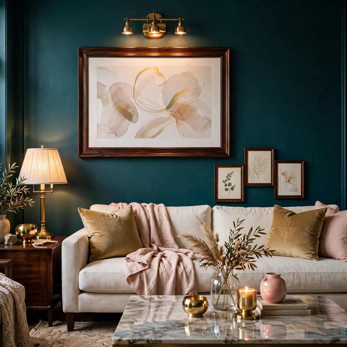
Art hung too high is the most common wall-decor mistake, and the fix is a single number: the center of the artwork should sit about 57 inches from the floor, roughly average eye level. Above a sofa, that usually means the bottom of the frame sits 6 to 10 inches above the sofa back. The concrete example: a 30-by-40 print above a standard sofa — its center lands at 57 inches when the frame’s bottom edge is 8 inches above the sofa back, which feels connected to the furniture instead of floating near the ceiling. For gallery walls, treat the whole arrangement as one piece and center the arrangement at 57 inches.
Quick tips:
- Quick tips:
- Center artwork at about 57 inches from the floor.
- Above a sofa, leave 6–10 inches between the sofa back and the frame.
- Center a gallery wall as one unit, not each frame separately.
Layer Three Kinds of Light
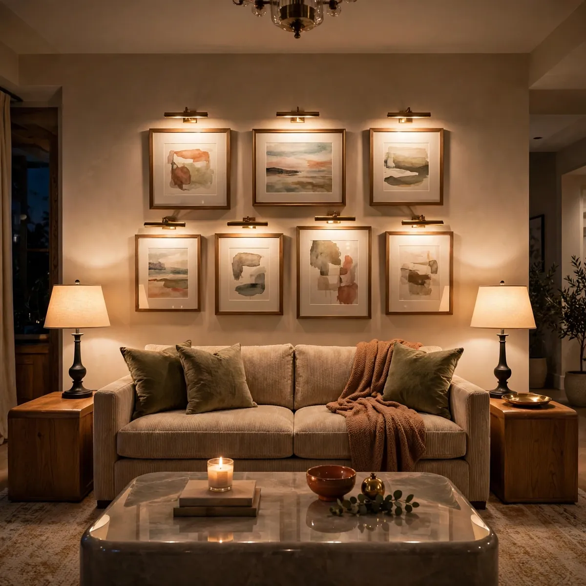
One overhead light flattens a room; three layers of light give it depth and mood. Plan ambient light (the general glow: ceiling fixture or floor lamp), task light (reading and working: table lamps, swing-arm sconces), and accent light (the drama: picture lights, candles, LED strips on shelves) — then use them in different combinations through the day. The concrete example: a living room with a dimmable ceiling fixture for cleaning and gatherings, a table lamp beside each end of the sofa for reading, and two picture lights washing the gallery wall — evening mode is lamps plus art lights only, and the room glows instead of glaring. Put the layers on separate switches or smart plugs so moods are one tap away.
Quick tips:
- Quick tips:
- Plan ambient, task, and accent light — never rely on one overhead.
- Put layers on separate switches for instant mood changes.
- Use warm 2700–3000K bulbs for evening coziness.
Mix Wood Tones Instead of Buying a Matching Set
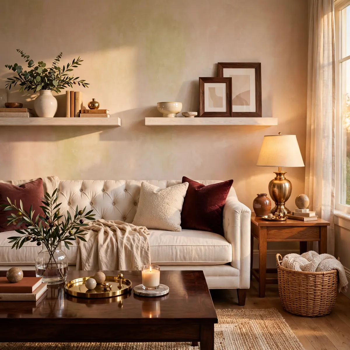
Furniture that all matches perfectly looks like a showroom; rooms that feel collected mix wood tones with intention. The rule is repetition: use two or three wood tones, and repeat each one at least twice around the room so the mix reads deliberate rather than accidental. The concrete example: a walnut coffee table paired with white oak floating shelves and a medium-toned side table, with the walnut echoed in two picture frames and the oak echoed in a woven basket — dark, medium, and light woods all appear twice, and the room feels gathered over time. Keep the undertones consistent (all warm or all cool) so the tones harmonize.
Quick tips:
- Quick tips:
- Use two or three wood tones and repeat each at least twice.
- Keep undertones consistent — all warm or all cool.
- Break up matching sets; pairs look designed, full sets look staged.
Use Symmetry, Then Break It Once
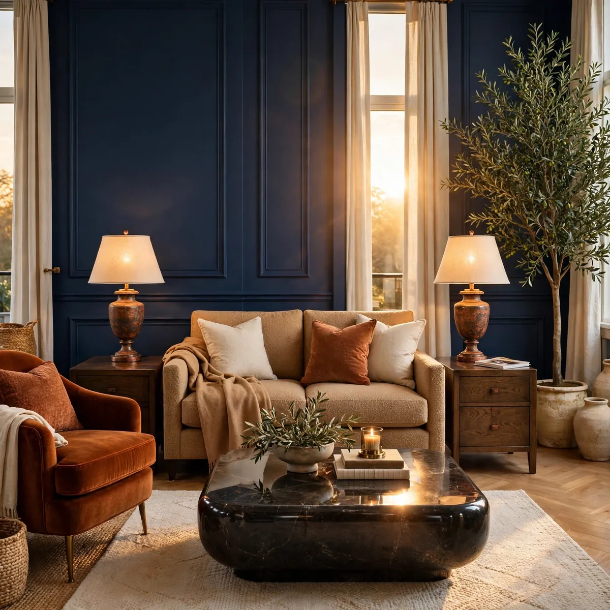
Symmetry calms the eye — matching lamps, matching chairs, matching side tables create instant order — but perfect symmetry feels staged, so break it exactly once. One deliberate asymmetry (a single bold chair, an off-center plant, art hung slightly left of center) keeps the room feeling human and lived-in. The concrete example: a sofa flanked by two identical table lamps and two matching side tables, but with a rust velvet armchair on only one side and a tall olive tree on the other — the symmetry gives structure, the single break gives personality. If everything matches, the room looks like a catalog; if nothing matches, it looks accidental.
Quick tips:
- Quick tips:
- Build symmetry with pairs: lamps, side tables, chairs.
- Break it once with a single contrasting piece, not three.
- Let the asymmetric piece be the boldest color or shape in the room.
Repeat Every Color at Least Three Times
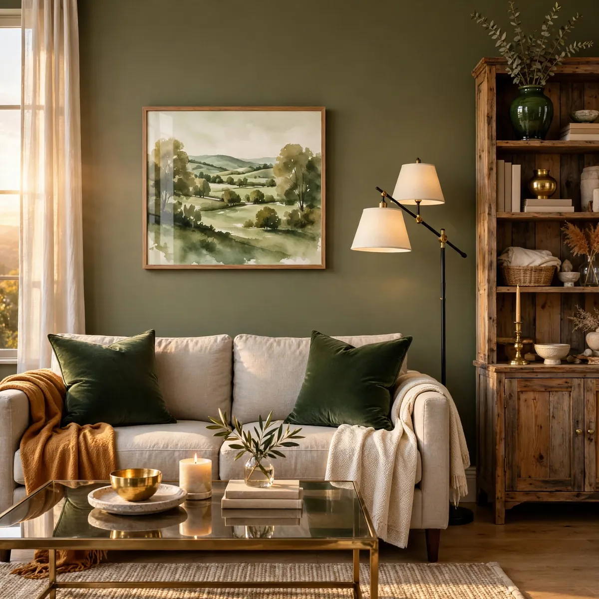
A color looks intentional when the eye finds it at least three times around the room; once looks like an accident, twice looks like a coincidence. This repetition rule is what ties pillows to art to objects into one cohesive palette. The concrete example: a deep green accent appears in two velvet pillows, the gallery wall’s landscape print, and a ceramic vase on the bookshelf — three touches at three heights (seating, wall, shelf) that make the green feel woven through the room. Repeat at different scales and heights so the color travels through the space instead of clustering in one spot.
Quick tips:
- Quick tips:
- Repeat each accent color at least three times around the room.
- Vary the height and scale of each repetition.
- Small objects (vases, books, candles) are the easiest third repetition.
Add Texture Before You Add Color
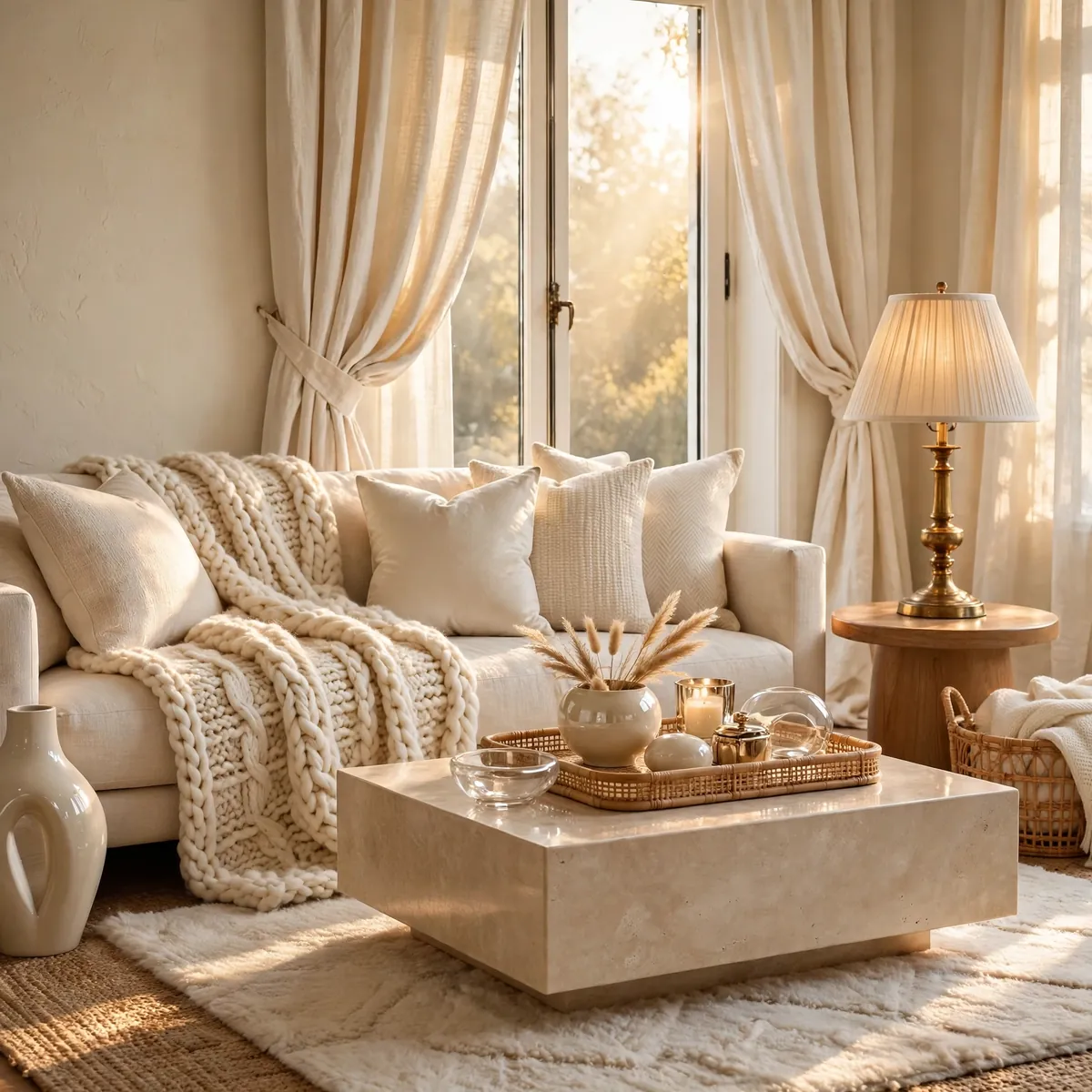
When a room feels flat, the missing ingredient is usually texture, not color. Layering linen, velvet, wool, wood, rattan, and metal creates visual richness even in a nearly all-neutral room, while adding another color to a flat room just makes it flat and colorful. The concrete example: an all-cream living room that felt boring came alive with a chunky knit throw, a jute rug under a wool rug, linen curtains, a rattan tray, and a brass lamp — zero new colors added, but the room gained the depth it was missing. Audit texture first: count the distinct materials in the room, and if you can’t name six, add texture before you add color.
Quick tips:
- Quick tips:
- Count distinct materials; aim for at least six in a living room.
- Pair rough with smooth: jute with velvet, raw wood with glass.
- Texture creates coziness quietly, without visual noise.
Hang Curtains High and Wide
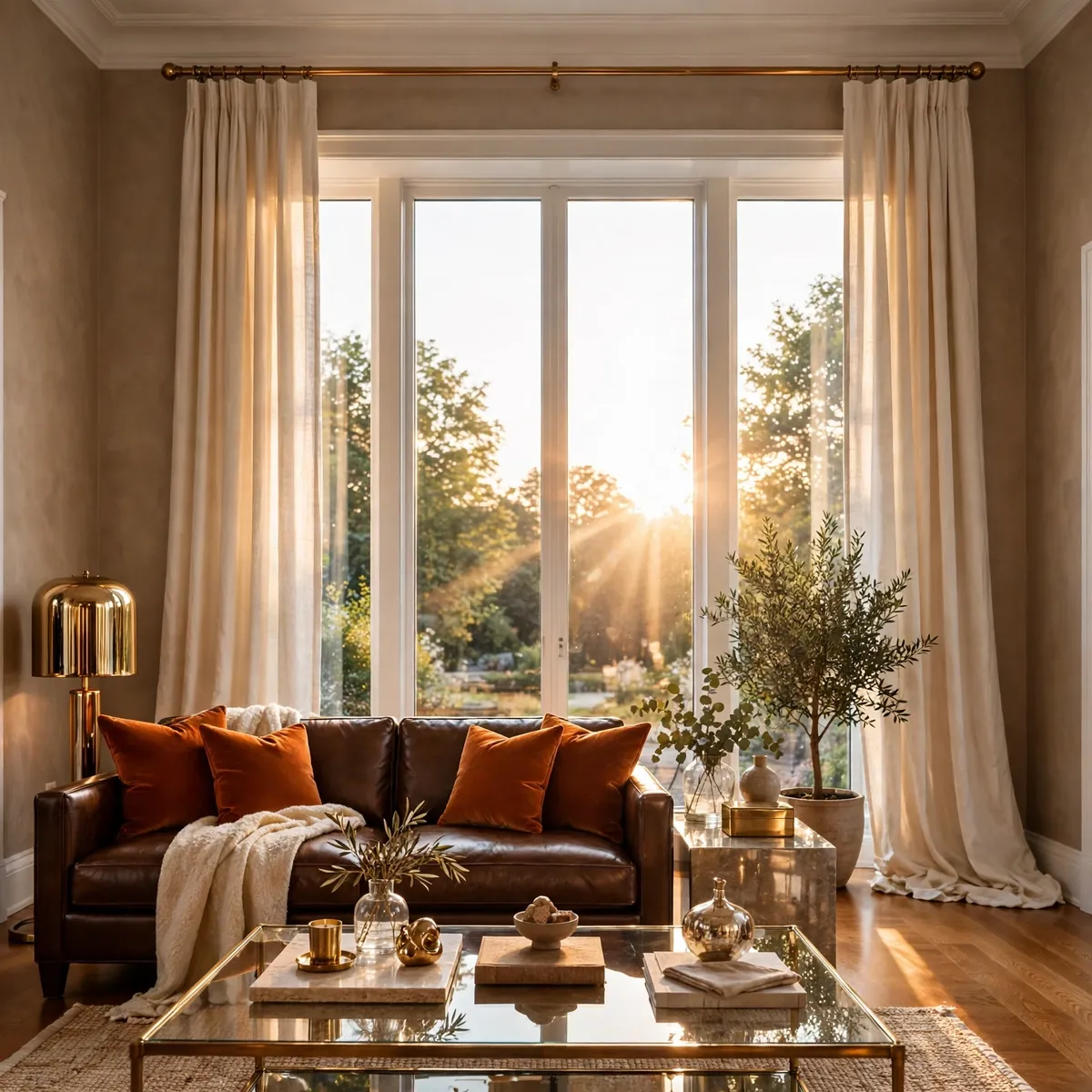
Curtain placement is an optical illusion: mount the rod 4 to 6 inches below the ceiling and extend it 6 to 8 inches beyond each side of the window frame, and the window looks taller, wider, and more expensive. Panels should just kiss the floor. The concrete example: a 5-foot window with the rod mounted near the 9-foot ceiling and panels in warm ivory linen — the window reads as nearly full-height, the ceiling feels taller, and when the panels are open they stack on the wall instead of blocking light. Hanging the rod just above the frame, by contrast, visually shrinks the window and chops the wall.
Quick tips:
- Quick tips:
- Mount rods 4–6 inches below the ceiling, not just above the frame.
- Extend 6–8 inches past each side so open panels clear the glass.
- Panels should just touch the floor — no puddling, no hovering.
Define Zones in an Open Plan
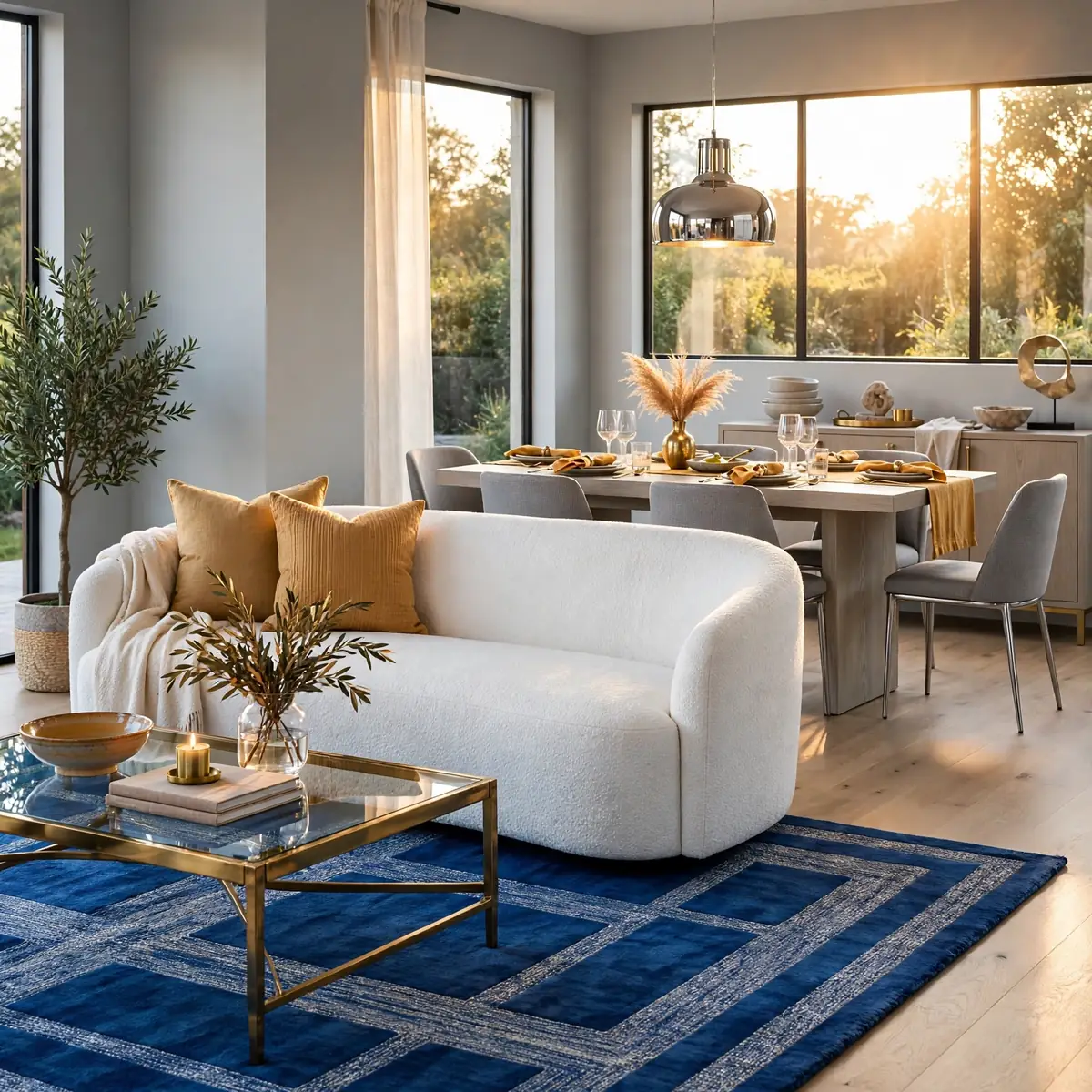
Open-plan rooms need invisible boundaries or they read as one restless space. Define each zone — living, dining, work — with a rug, a lighting change, or a furniture back, so the eye understands where one area ends and the next begins. The concrete example: in a combined living-dining room, an 8-by-10 rug under the seating group defines the lounge, a pendant hung low over the dining table defines eating, and the sofa’s back faces the dining area as a soft divider — three zones, zero walls. Repeat one color across zones so the open plan still feels like one home, not three rooms sharing air.
Quick tips:
- Quick tips:
- Use rugs as the primary zone-definer in open plans.
- Change the lighting per zone: pendant for dining, lamps for lounging.
- Turn a sofa back into a soft room divider between zones.
Scale Furniture to the Room With the Two-Thirds Rule
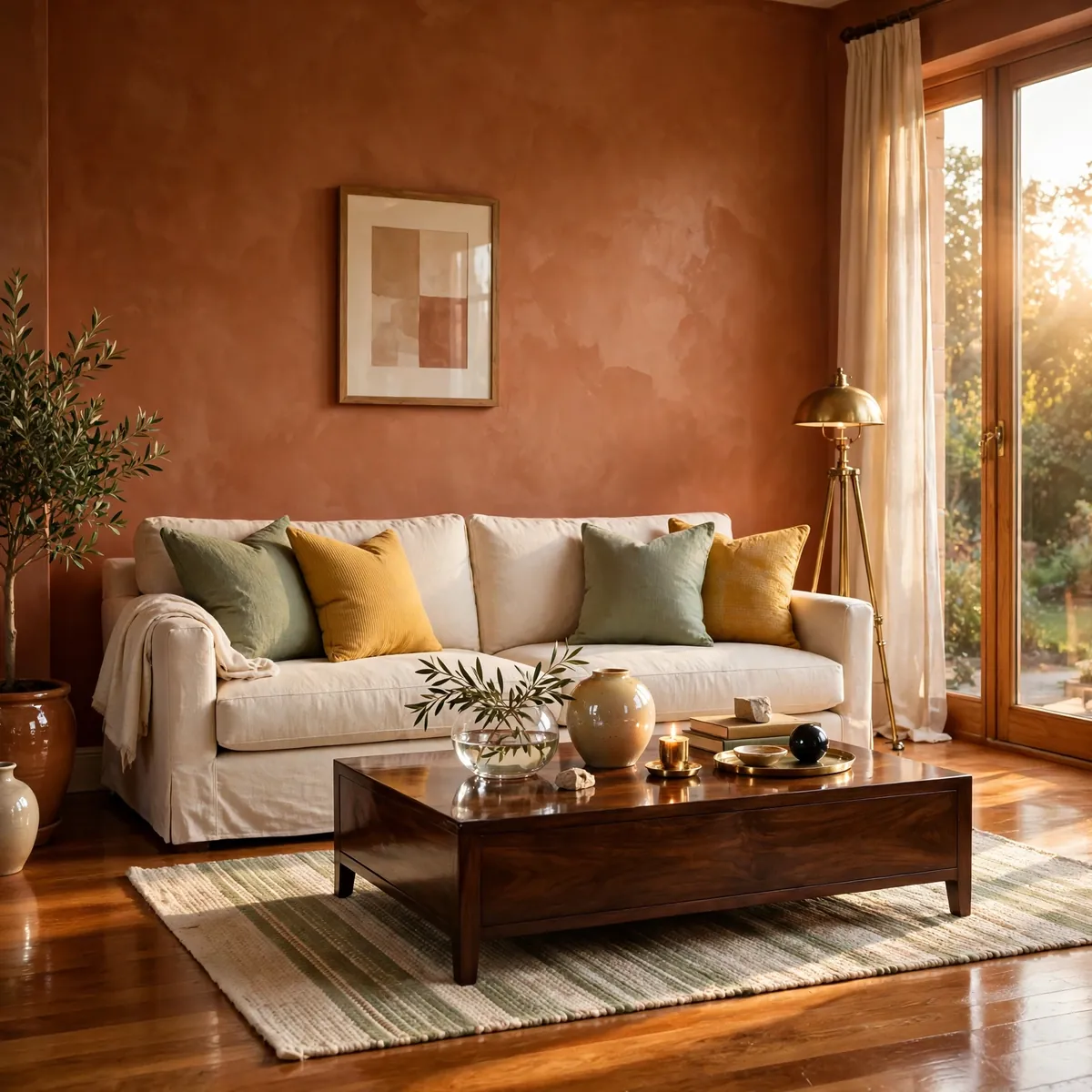
Furniture looks right when its scale relates to the room and to its neighbors, and the two-thirds rule is the handiest proportion guide: a sofa should be roughly two-thirds the length of the wall or seating zone behind it, and a coffee table roughly two-thirds the length of the sofa. The concrete example: against a 12-foot seating wall, an 8-foot (96-inch) sofa leaves comfortable breathing room on each side; paired with it, a 60-inch coffee table keeps the proportions harmonious. It’s a starting point, not a law — adjust for walkways and comfort — but it prevents the two classic errors: a lost tiny sofa on a huge wall, or a sectional swallowing the room.
Quick tips:
- Quick tips:
- Sofa ≈ two-thirds the seating wall; coffee table ≈ two-thirds the sofa.
- In small rooms, scale down: loveseat plus chairs beat a squeezed sectional.
- Always check walkway clearance after sizing — proportion serves flow.
Leave Some Walls Deliberately Empty
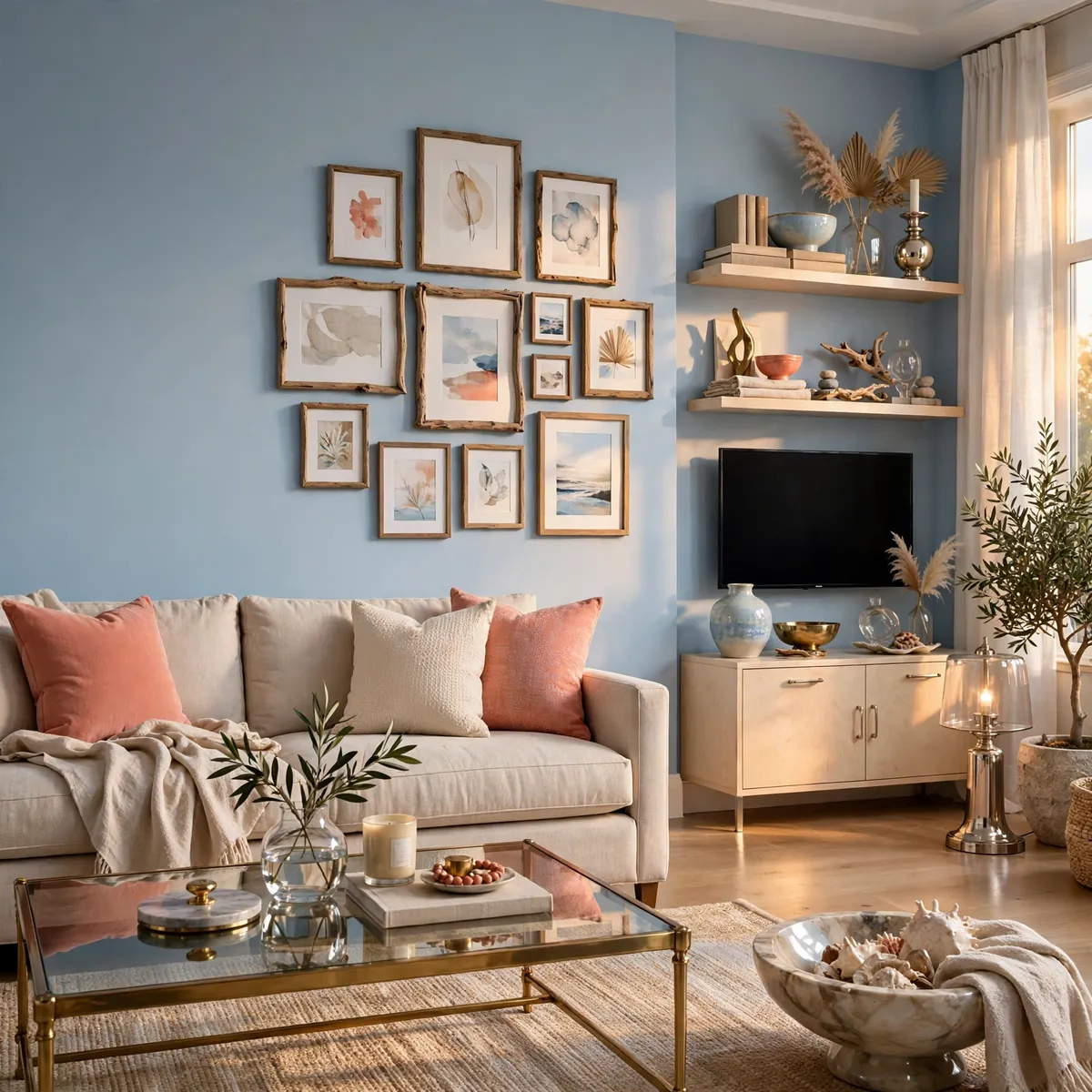
Negative space is a decorating decision, not a failure to decorate. A completely styled room with art on every wall feels restless; one or two calm, empty walls give the eye somewhere to rest and make the styled walls look more important. The concrete example: in a living room with a gallery wall over the sofa and styled shelves beside the TV, the third wall stays completely bare except for paint — and guests consistently compliment the gallery wall more, because the empty wall gives it visual room to breathe. Decorate the important walls well, then stop; restraint is what separates designed rooms from decorated ones.
Quick tips:
- Quick tips:
- Choose one or two feature walls and leave the rest calm.
- Empty space makes styled areas look more intentional.
- If a wall feels bare, try removing something elsewhere first.
Style Shelves in Odd Numbers
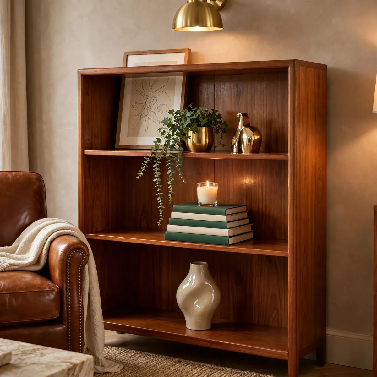
Odd-numbered groupings look natural to the eye while even numbers look staged — the 3-5-7 rule of styling. Group shelf objects in threes, fives, or sevens, varying height, shape, and texture within each group. The concrete example: a bookshelf styled with a group of three on one shelf (a leaning art print, a small plant, a brass object at three different heights), a stack of five books topped with a candle on the next, and a single sculptural vase alone on the third — every shelf follows the odd-number rhythm and the whole bookcase feels effortlessly arranged. Step back after each group; balance is judged at a distance.
Quick tips:
- Quick tips:
- Group shelf objects in 3s, 5s, or 7s — never matched pairs alone.
- Vary height, shape, and texture within each grouping.
- One striking object alone beats two mediocre ones paired.
Pick the Sofa Before Anything Else
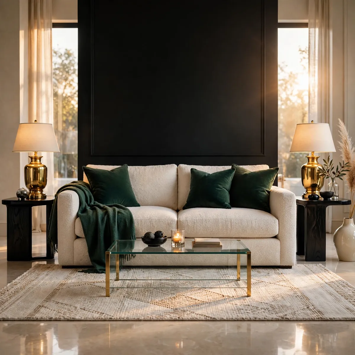
The sofa is the room’s biggest, most expensive, and hardest-to-change decision, so it comes first — every textile, color, and accessory choice flows from it. Choose for comfort and silhouette in a versatile tone, since everything else in the room is cheaper to change later. The concrete example: a decorator choosing between a rust velvet sofa and an oatmeal linen one picks the oatmeal linen, knowing rust can arrive later through $40 pillow covers while a wrong sofa is a $2,000 mistake — the neutral sofa keeps every future option open. Sit-test before buying, measure the doorways it must pass through, and confirm the depth suits how you actually lounge.
Quick tips:
- Quick tips:
- Choose the sofa’s comfort and silhouette first; color second.
- Favor versatile tones — accents are cheaper to change than sofas.
- Measure doorways, stairwells, and the final spot before ordering.
Test Paint Swatches in Morning and Evening Light
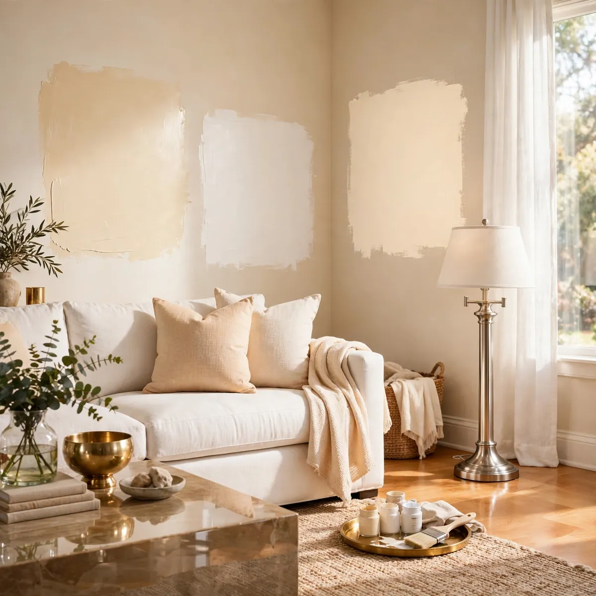
Paint never looks on the wall like it looked on the swatch card, because light temperature changes everything — a warm greige at noon can turn pink at dusk under warm bulbs. Paint large test patches (at least 2 feet square) on two walls and live with them for 48 hours before committing. The concrete example: a “warm white” that looked perfect in the store showed yellow under the room’s 2700K evening lamps, so the decorator tested three whites and chose the one that stayed clean at night — a $30 sample-pot detour that prevented repainting the whole room. Test next to the sofa and rug, not on an isolated wall, since paint is judged against its neighbors.
Quick tips:
- Quick tips:
- Paint test patches at least 2 feet square on two different walls.
- Judge the color in morning daylight and evening lamplight.
- Test beside the sofa and rug — context changes everything.
Float the Sofa a Few Inches Off the Wall
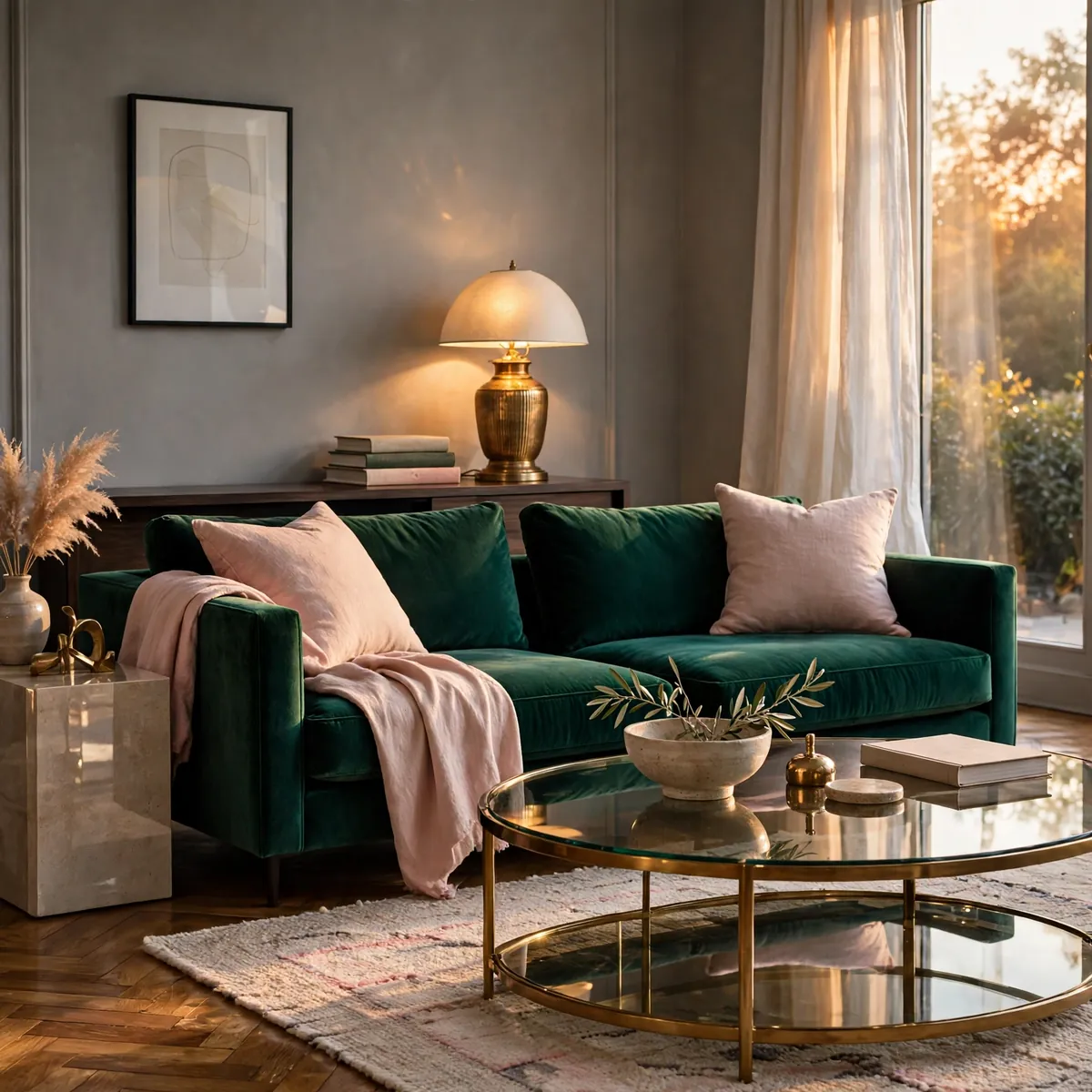
Pushing every piece of furniture flat against the walls doesn’t create space — it creates a waiting room. Pulling the sofa even 4 to 8 inches forward adds depth behind it, makes the arrangement feel designed, and opens the option of a slim console or lamp behind. The concrete example: a sofa pulled 6 inches off the wall with a narrow console table behind it holding a lamp and a stack of books — the seating zone gains a backdrop, the lamp adds light exactly where readers sit, and the room reads as layered instead of pushed-aside. Keep the walkway behind clear; floating works only when traffic still flows.
Quick tips:
- Quick tips:
- Pull the sofa 4–8 inches off the wall for instant depth.
- Use the gap for a slim console, lamp, or plant.
- Never float furniture into the main traffic path.
Choose Rug Size Before Rug Style
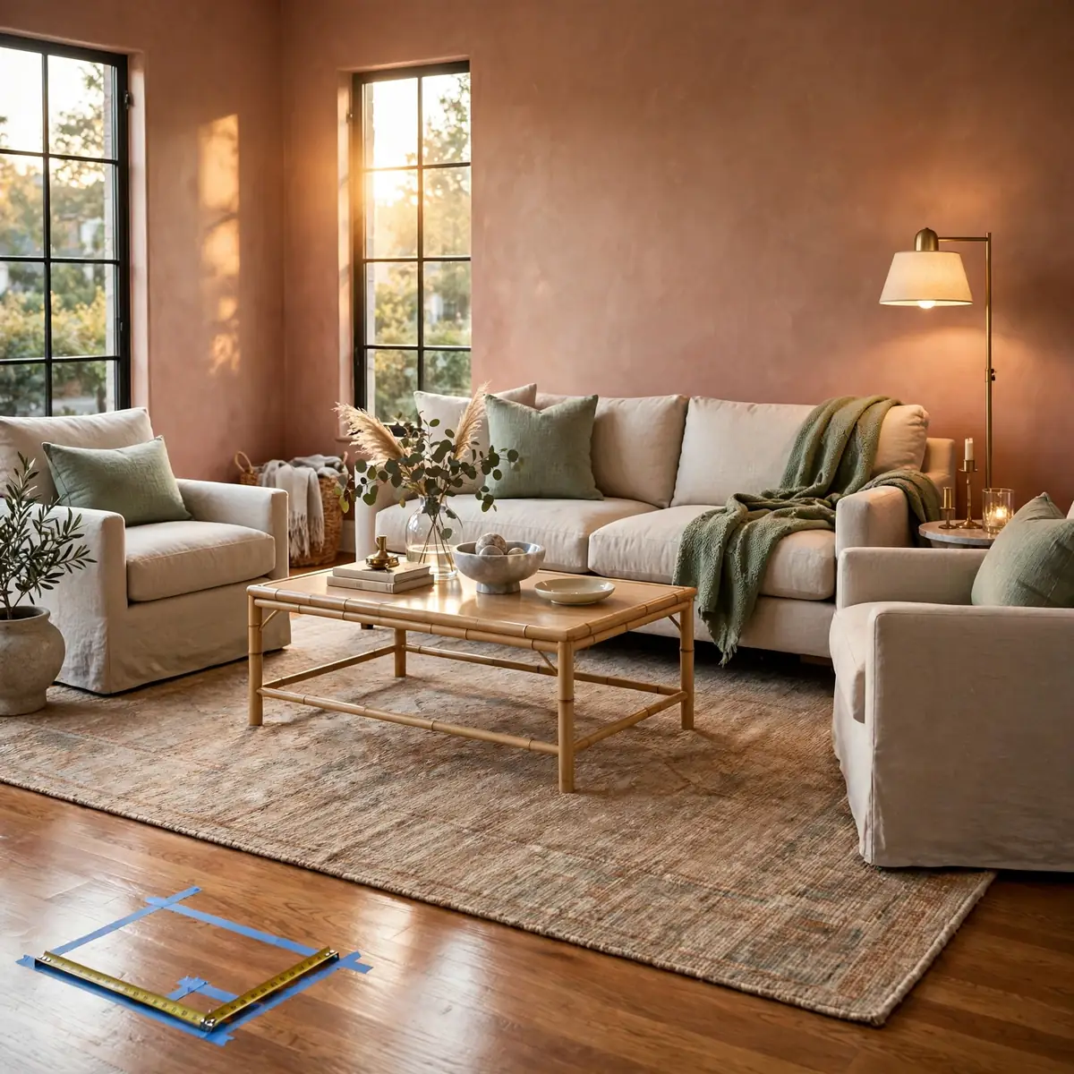
Rug shopping should start with measurements, not patterns — a beautiful rug in the wrong size ruins the layout, while a plain rug in the right size makes the room work. Measure the seating zone first: the rug must reach under the front legs of the sofa and chairs, which in most living rooms means 8-by-10, not 5-by-7. The concrete example: a decorator tapes an 8-by-10 outline on the floor, confirms all seating front legs land inside it, and only then starts browsing patterns — the shortlisted rugs all fit, so the final choice is purely about look. Falling in love with a pattern first leads to the classic mistake: a too-small statement rug that makes the room look scattered.
Quick tips:
- Quick tips:
- Measure the seating zone and tape the outline before shopping.
- Default to 8-by-10 for standard living rooms; size up, not down.
- Choose the pattern only after the size is locked in.
Decide How You Actually Live in the Room First
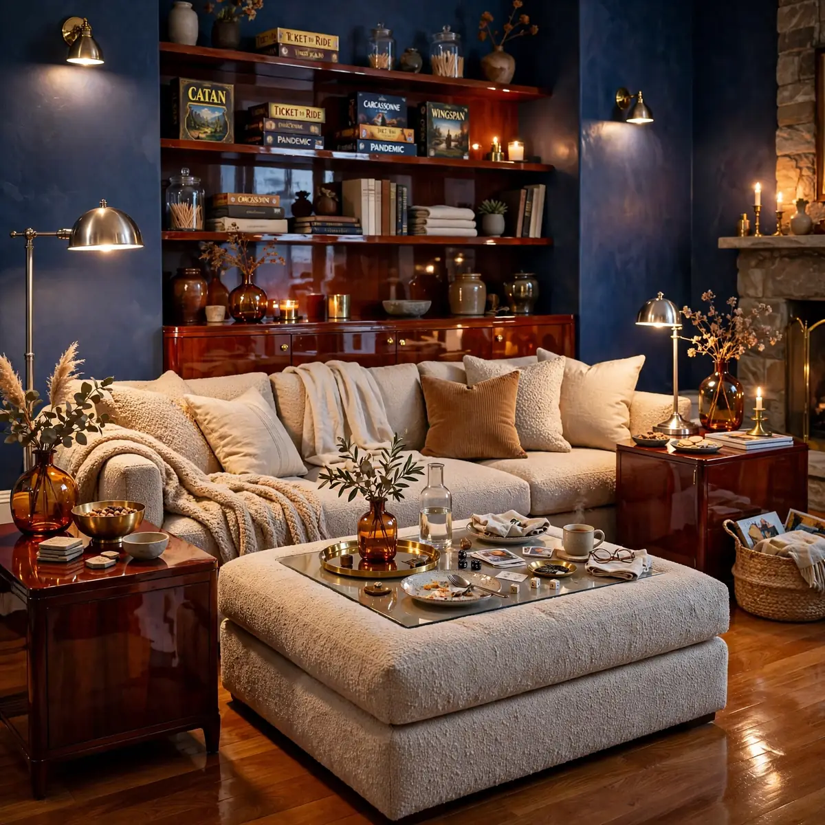
The most important decorating decision has nothing to do with decor: it’s an honest inventory of how the room gets used. A household that hosts weekly game nights needs flexible seating and a big coffee table; a household of readers needs the best chair by the best light; a TV-first family needs sightlines more than symmetry. The concrete example: a couple who admitted they eat dinner on the sofa every night skipped the formal armchairs, bought a deep sectional and an oversized ottoman that doubles as a table — the room fits their life instead of judging it. Decorate for the life you have, not the life a catalog imagines.
Quick tips:
- Quick tips:
- List the room’s real activities before buying anything.
- Let heavy-use habits (TV, reading, hosting) drive the layout.
- Ignore trends that don’t fit how you actually live.
Blend One Vintage Find Into New Pieces
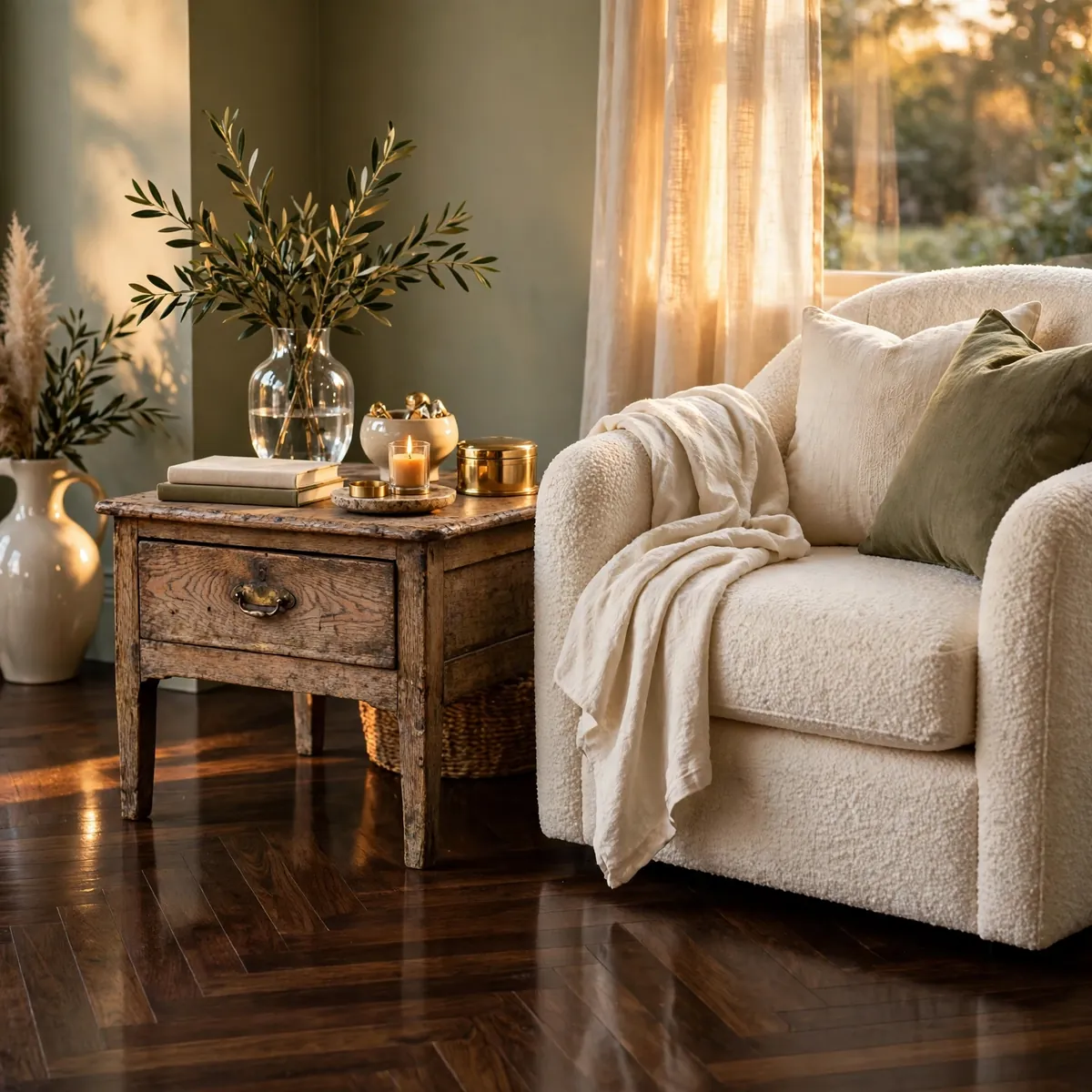
Rooms where everything is brand new feel flat; one aged piece gives the whole room a sense of history and makes the new furniture look collected rather than delivered. The contrast is the point — patina against clean lines reads as taste, while all-old reads as dated and all-new reads as a showroom. The concrete example: a weathered oak side table with visible grain and old brass hardware placed beside a new boucle armchair — the table’s age makes the chair look curated, and the chair’s freshness keeps the table from looking shabby. One vintage piece per room is enough; it’s an accent, not a theme.
Quick tips:
- Quick tips:
- One vintage piece per room adds soul without cluttering.
- Pair aged wood or brass with clean modern lines for contrast.
- Check vintage electricals and rewire old lamps for safety.
Edit Every Surface: Remove One Thing
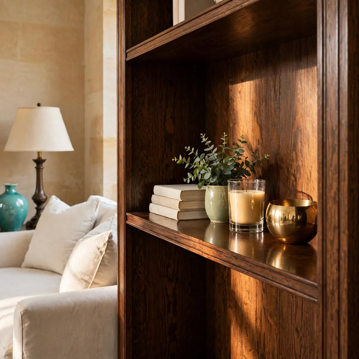
The final decorating step is subtraction. After styling a surface, remove one object — the room almost always looks better, because beginners decorate by adding and designers finish by editing. The concrete example: a styled bookshelf with books, a plant, a candle, a framed photo, and a brass object loses the framed photo (which moves to the bedroom) — suddenly the remaining four objects have room to breathe and the shelf looks intentional instead of crowded. Do this on every surface: coffee table, console, mantel, shelves. If removing something makes you nervous, live without it for a week before deciding.
Quick tips:
- Quick tips:
- After styling, remove one object from every surface.
- Relocate removed pieces to other rooms instead of discarding.
- When in doubt, the room needs less, not more.
Plan Plant Placement at Two Heights
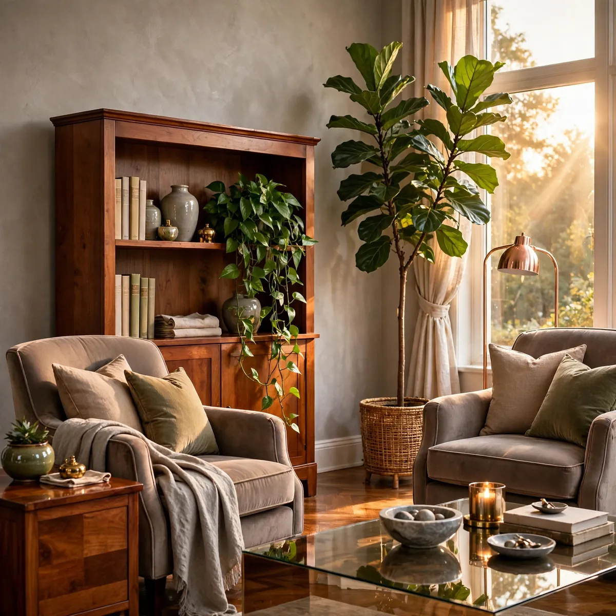
Plants decorate best when they’re placed with the same intention as furniture: one tall floor plant for vertical presence and one smaller plant at table or shelf height for the middle layer. Two heights create a rhythm the eye follows; six plants all on one shelf just create a shelf of plants. The concrete example: a 5-foot fiddle-leaf fig in the corner beside the window plus a trailing pothos on the bookshelf’s middle shelf — the tall plant draws the eye up, the trailing plant softens the shelf, and the room feels alive at two levels. Match each plant to its actual light spot, and choose low-maintenance varieties if you’re not a plant person.
Quick tips:
- Quick tips:
- Use one tall floor plant plus one table- or shelf-height plant.
- Place the tall plant where it draws the eye upward.
- Match plants to real light conditions, not wishful ones.
Live With the Room a Week, Then Adjust
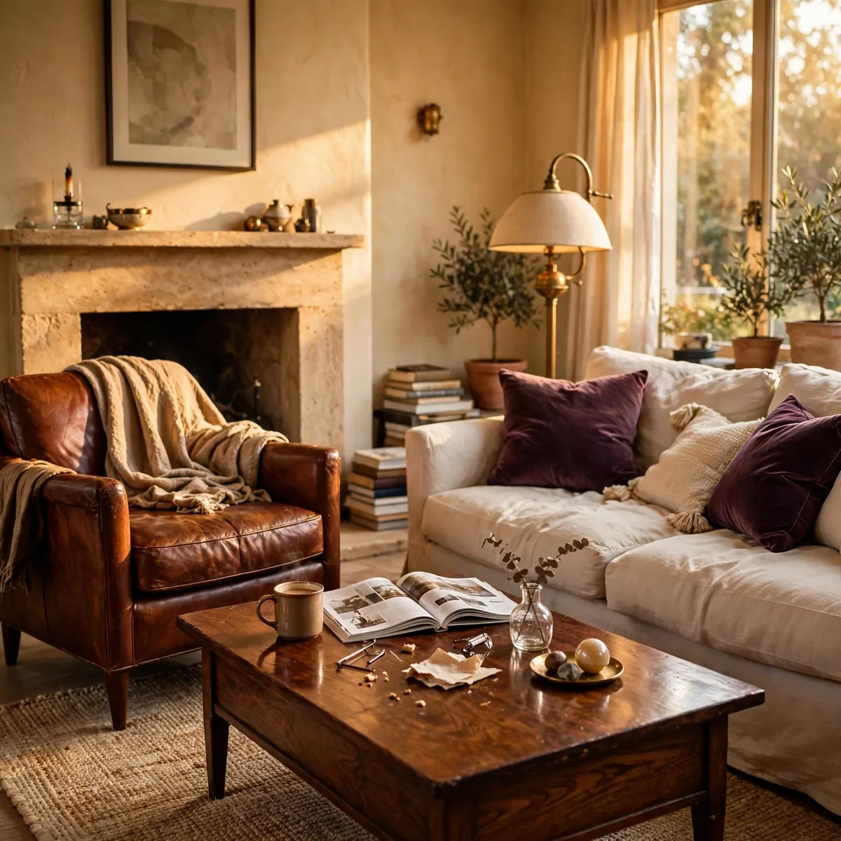
No room is finished the day it’s decorated — it needs a week of real life to reveal what’s wrong. The chair nobody sits in, the lamp that’s always in the way, the art that looked right empty but feels wrong with people in the room: a week of living exposes all of it. The concrete example: after a full refresh, a decorator noticed everyone avoided the new armchair because it faced away from the conversation — one 45-degree rotation toward the sofa fixed it, a change no amount of staring at the empty room would have suggested. Schedule the adjustment week deliberately: decorate, live, then move exactly what real use tells you to move.
Quick tips:
- Quick tips:
- Plan a one-week “living test” after any decorating push.
- Watch which seats get used and which get avoided.
- Adjust based on real use, not on how the empty room photographs.
FAQs
Where do I start when decorating a living room?
Start with how you use the room, then choose one focal point — a fireplace, window, large art piece, or the TV — and arrange seating to face it. Next, settle the layout with clear walkways, then pick a color palette, then buy the biggest pieces (sofa, rug, chairs) before any small decor. Working from large decisions to small details prevents the most common beginner mistake: accessories that don’t fit the finished room.
What is the 60-30-10 rule in decorating?
It’s a color-balancing formula: about 60% of the room in one dominant color, 30% in a secondary color, and 10% in an accent color. Typically the dominant color covers walls and the sofa, the secondary covers the rug and curtains, and the accent appears in pillows, art, and small objects. The ratio keeps rooms cohesive — neither flat from too little contrast nor chaotic from too much.
What is the 2/3 rule for living rooms?
The 2/3 rule is a proportion guideline: a sofa should be roughly two-thirds the length of the wall or seating zone behind it, and a coffee table roughly two-thirds the length of the sofa. It prevents the two classic scale mistakes — furniture that looks lost on a big wall, or pieces that overwhelm the room. Treat it as a starting point and adjust for walkways, doors, and comfort.
What is the 3-5-7 rule of decorating?
It’s a styling guideline that says groupings of decor look most natural in odd numbers — 3, 5, or 7 objects together. A coffee table, mantel, or shelf styled with three varied-height objects reads as effortless, while matched pairs can look stiff. Vary height, shape, and texture within each grouping, and judge the balance by stepping back a few feet.
How much walking space should a living room have?
Aim for about 30 to 36 inches of clear space on main walkways — the paths between the door, the seating, and other rooms. Secondary squeezes behind furniture can be tighter, but the main traffic route should never force anyone to sidestep. Tape walkways on the floor with painter’s tape during planning, since layouts that look fine on paper often block real movement.
Conclusion
Decorating a living room well is a sequence, not a shopping trip. Decide how you live in the room, choose a focal point, protect your walkways, build a color formula, buy the big pieces first, layer the light, hang art at eye level, and finish by editing rather than adding. Each of these 25 decisions makes the next one easier, which is exactly why order matters more than budget. A warm, lived-in room is never an accident — it’s the result of decisions made in the right order, and now you know the order.